
A TIRELESS EXAMINER OF ART’S MOST FUNDAMENTAL ELEMENTS SHARES HER DISCOVERIES
by brutjournal Editor in Chief Edward M. Gómez, in dialogue with Suzan Frecon
Based in New York and in a village in the Hudson Valley, north of the city, the American painter Suzan Frecon was born in 1941 in Mexico, Pennsylvania, and earned a degree in fine arts from Pennsylvania State University in 1963. She went on to spend a few years in Paris studying at the École Nationale Supérieure des Beaux-Arts and, during that time, traveled around Europe to examine in person the treasure troves of paintings on view at the continents’ great museums.
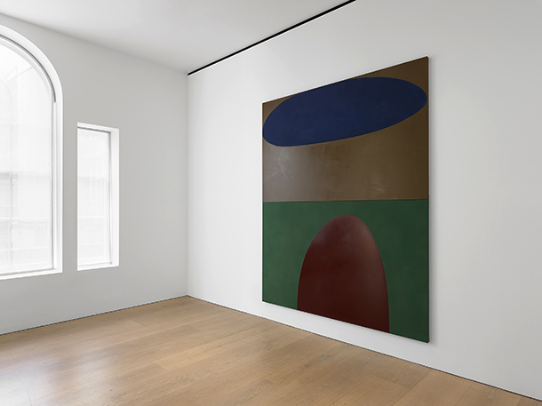
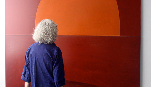
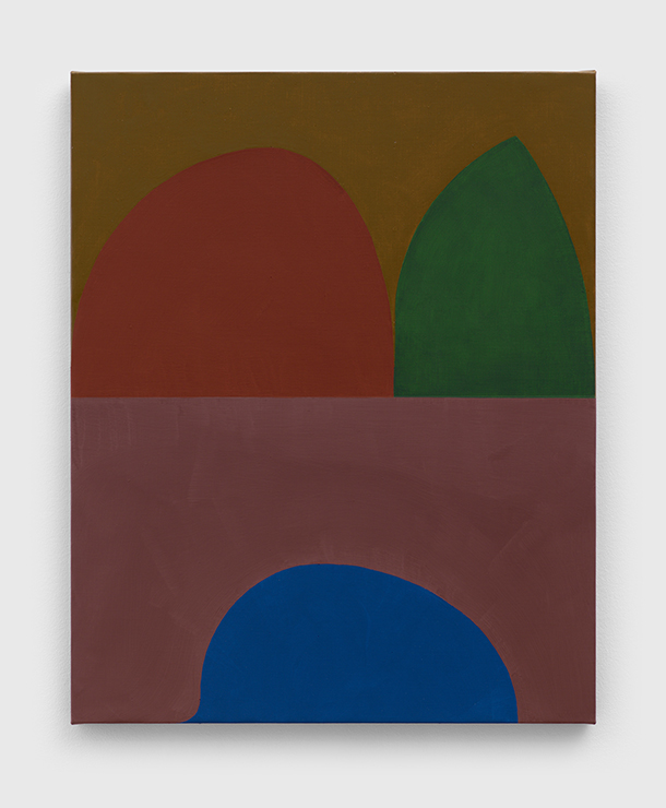
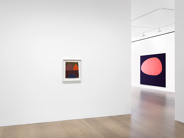
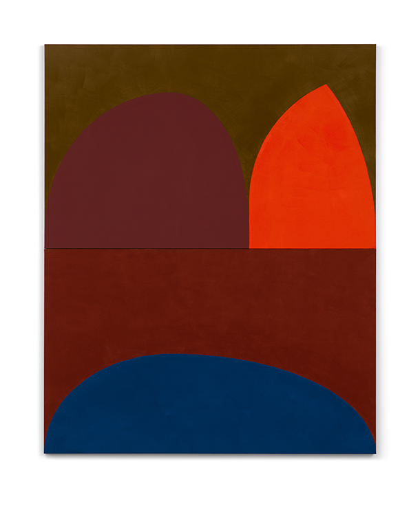
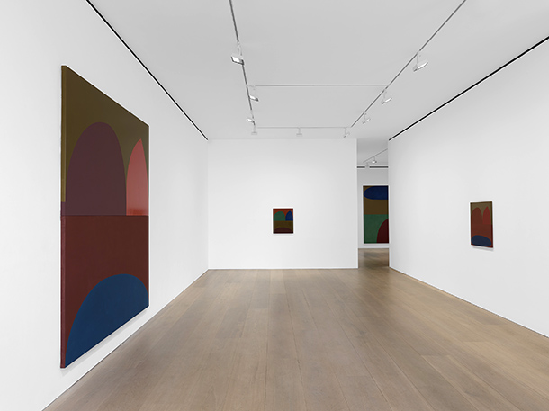
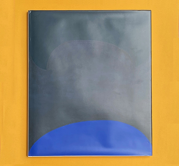
Over the decades, Frecon has developed a distinctive mode of abstract painting in which color and form are as much her abiding subjects as is the expressive power of her compositions. Although at first they appear to be simple, unfussy arrangements of just a few shapes at a time, in fact the artist may spend a long time producing each of her paintings, which often feel monumental in their proportions and actually are large in size. In them, she carefully balances the energies and visual effects of her colors, compositional rhythms, and forms.
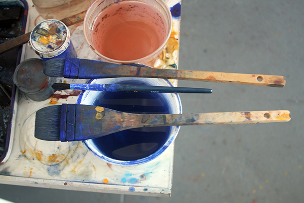
Using raw color pigments, Frecon also mixes her own oil paints. She has long believed that her paintings are works of art that “speak for themselves” and are meant to be experienced, not just looked at in a routine manner.
Earlier this year, in recognition of her contributions to the field of art, Frecon was inducted into the New York-based American Academy of Arts and Letters.
I first met and interviewed Frecon several years ago at her studio in Manhattan, at which time she told me about her ongoing investigation of color, form, and the alluring character of oil paint. Knowing how much color means to her and how big a role it plays in her work — her interest is both intellectual and deeply passionate — and considering this issue of brutjournal’s focus on color, recently we spoke again about this endlessly intriguing subject.
brutjournal: When we first met several years ago, I was writing an article about your work for the magazine Art & Antiques. At that time, you told me that, around 1986, when you made your first-ever trip to Venice, you were deeply moved by the Renaissance-era paintings you encountered there, both in situ in churches and historical buildings, and in museums.
Looking back to that trip, can you recall any particular aspects of the use of color in the paintings you saw in Venice that impressed you and turned out to become lasting influences on your own art-making?
Suzan Frecon: I tried to see every Giovanni Bellini painting in Venice. “The Presentation in the Temple” [circa 1460, tempera on panel, on view at the Fondazione Querini Stampalia], when I finally found it in an obscure and very quiet location, was extraordinary. I was alone with it in the room; it was unframed, displayed on an easel, and lit only by natural light coming though a window.
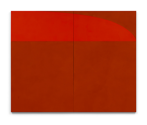
I had read that such Venetian painters as Bellini and Giorgione had painted on red grounds, so I wanted to see for myself the warmth of the light that red grounds imparted to their paintings. I also had read that the Florentines, on the contrary, had painted on gray grounds. Painting on red grounds interested me, so for a time I began painting on earth-red grounds, although I hated covering the beautiful red-earth colors.
Previously, I had been using cadmium reds in my paintings, but later, traveling and seeing the red earths everywhere in nature and art, and in pre-Renaissance fresco paintings served to reinforce my use of more red earths and my phasing-out of cadmiums. I didn’t rule out cadmium reds, though, and, occasionally I’ll use one or two sparingly if I need to.
brutjournal: Even today, a viewer who is familiar with various Renaissance painters’ palettes can sense echoes of their colors in your own.
Suzan Frecon: [Following that first trip to Venice years ago,] I traveled to Florence many times and to other parts of Italy. I also traveled to Crete, where many of the artworks I saw and experienced in museums and fresco paintings, too, entered the path of my own work. As an abstract painter, the more I looked at Italian paintings, the more pre-Renaissance art became more important to me than the classical styles of Renaissance paintings.
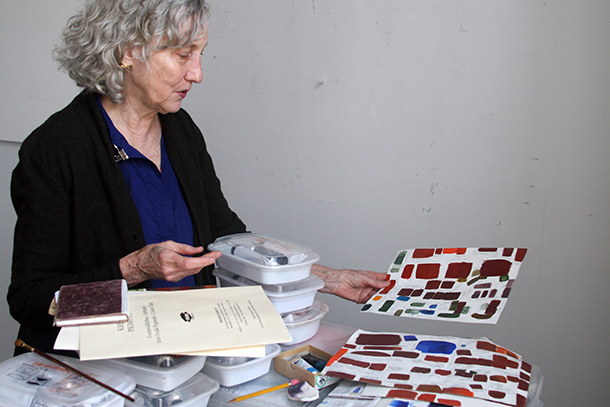
brutjournal: When I visited your studio a few years ago, you showed me the oil paints you had prepared yourself. You had mixed raw pigments with oil to produce your own paints, and I remember seeing sketches with some of your color-recipe notes.
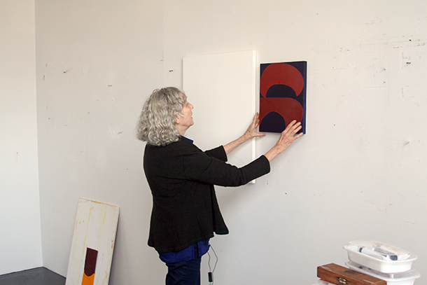
Suzan Frecon: Yes, there always seem to be many sketches that go into working out my compositions for paintings. I keep precise notes, which are very helpful to refer to as I develop paintings.
brutjournal: Today, do you still prepare your own oil paints?
Suzan Frecon: I still prepare some paints from raw pigments, usually red-earth pigments. I choose them because I like the colors and I can get plays of varying sheens from adding specific quantities of linseed oils. Every step I take [leads to] the resulting visual effect.
There are no theories or stories [that serve] as a reason for the realization of my paintings. Every step [of my art-making process is followed so that] the sensory experience of the viewer will be the most it can be, without leaning on any story. I want each painting to exist solely on its own strength as art. So, of course, color is vital to the most heightened experience possible.
For the most part, I now prefer colors that are already ground in tubes from good paint manufacturers so that I don’t have to spend hours of painting time grinding colors. But if I can’t find a color I want except in raw pigment form, I will grind it myself. For example, I am currently making a painting in which I want the green to be precisely French terre verte, from Kremer pigments. It is very difficult to grind and takes up time I would rather use to paint the painting, but I need that green and I can only make it myself.
brutjournal: Given that you make some very large paintings, do you tend to prepare large batches of the paints you use most often — liters or gallons of paints at a time?
Suzan Frecon: I try to prepare enough for however many layers I will need but often I have to remix and adjust the colors and their mediums accordingly. I measure my mixtures of paint and note them, so that as time goes on, I sort of get to know how much I will need to cover the larger surfaces.
brutjournal: The visual impact and power of the forms that appear in your compositions seem to come as much from their simple but monumental size or appearance as they do from the play of colors within each composition.
Suzan Frecon: The process of finding the colors can stretch over a long period of time, or they can work together visually, right away. Initially, ideas are in my mind’s eye — or inner vision — and often evolve or spring from previous paintings. Or they can enter due to an exterior catalyst that works with my concepts and previous works.
I make many small color samples and trials in oil paint. These, combined with sketches for a future composition, work in tandem toward the development of a plan to be precisely worked out on graph paper for a large-scale painting. My large oil paintings are the core of my work. Their scale is part of my intention to [affect] to the maximum the experience of a viewer when he or she actually sees a painting.
brutjournal: These remarks indicate that you’re very aware of and, at this stage of your career, very much in command of your creative process.
Suzan Frecon: Each painting’s plan is precisely worked out in areas that relate to each other mathematically, but only toward the end of visual rightness. The linear compositions are generated by the outside mean of the stretcher bars and become the bedrock of everything that holds the painting. Resulting figure and ground, or full area and void, often become interchangeable — mainly, I think, through the use of color and its properties and handling. I intend for this to add to the visual movement and dimensions of the painting. The finished work should be strongly built yet ungraspable or enigmatic, and even dissonant at times.
By contrast, in my watercolors, the paper’s size, its edges, and the physical makeup of the paper itself help determine a painting’s realization but they are part of the same unity as the large oil paintings.
The more colors in a painting, the longer it takes to be completed, and the last color is usually the most difficult to resolve within the entire visual context [of a particular work]. The colors have to work in relation to each other and within the unity of the whole.
As the painting progresses, I constantly look, adjust, and keep working until the painting starts to go beyond the two-dimensional, and its content and suspension seem to begin to exist visually in the space between the viewer and the physical painting — or, as I say, “When it starts to come off the walls.”
Composition, color, paint material, and light all start working together, and paint-handling or virtuosity should develop and become innate to the strength of the painting. The asymmetries of the composition also help set up movement and light from the painting; balances through imbalances deliberately contribute to the visual life of the painting.
brutjournal: When I asked you to what extent you regard your paintings as studies in the character and expressive power of color, you responded that you see them 100-percent as such in-depth studies or investigations.
Now let me ask you this: When you begin thinking about a new painting, which comes first for you — your consideration of the forms you’ll depict or the palette and the play of colors you might like to explore within a new composition? Or do you think about the forms and their colors simultaneously?
Suzan Frecon: Each ingredient is part of the form of my painting and is integral to the unity of the whole. More often than not, the elements of a painting evolve together: form, color, the play of natural light on the paint materials, scale, paint handling, and so on. Color is vital to the existence of the paintings, and the other elements such as light, composition, and scale serve color. Of course, natural light has also become a vital component of a painting [in a] most heightened [way]. When my paintings are seen in under one fixed, static, artificial light source, a lot is lost from a viewer’s visual experience.
brutjournal: In art school, students often have opportunities to study so-called color theoryand to learn basic principles about the character of color. But it seems that many artists must explore color and discover the qualities and expressive potential of different colors on their own.
Suzan Frecon: Color theories are fascinating, and I often think I should read more about them. But finding colors and their relationships to each other firsthand through actual painting, as well as absorbing their sensations constantly, makes for a compelling education and [becomes] a driving force in my desire to paint.
brutjournal: In your experience over the years, what are some of the most fundamental, guiding principles or characteristics of certain colors that you’ve discovered on your own and that have served you well?
Suzan Frecon: In experiencing the world around me, the sunlight guides me always, as do colors in our natural environment transformed into infinite hues by the sun; paintings in museums; reproductions of art from far and wide that I haven’t been able to see firsthand; and carrying some of my experiences into making paintings that, in turn, can convey my sense of amazement about what I have experienced.
I want to emphasize that the reality of the painting itself is what I am seeking to achieve, not a depiction or illustration of things I have seen.
brutjournal: What you’re referring to might be called “pure painting.” It seems that you’re digging as deeply as you can into the very soul or essence of color and light, and then exploiting what you discover. Can you cite a few examples of the discoveries you’ve made or of the lessons you’ve learned with regard to a few colors that have been most meaningful to or useful for you?
Suzan Frecon: When I first saw a page from the Book of Kells [a 9th-century illustrated manuscript, in Latin, of the four Gospels of the Christian New Testament] in Dublin, Ireland, I realized that the colors I had observed as being on one plane in reproductions existed in reality on unfathomable planes, and that their depths were in constant yet infinite flux and movement!
I had the same experience when I saw the Maestà [an early 14th-century altarpiece in tempera and gold on wood] in Siena, Italy, by Duccio di Buoninsegna, and also at Chartres Cathedral, in France, where the light was coming from behind the colors in the church’s stained-glass windows rather than onto the surface of a painted color, as was usually the case.
It would take me much more time to try to describe all of the things and events that have transported me in such impactful ways, but seeing color in [the context of] such heights of experience has affected every particle of my physical — and mental — being. It has molded and even hammered me into what I am and into what I try to achieve as an artist and painter.