
SAVORING THE POWER AND ALLURE OF EVERY HUE AND SHADE
by Edward M. Gómez
Color us curious about every aspect of the character and expressive power of color.
I Am Curious (Yellow) — does anyone remember that controversial Swedish movie from 1967, whose companion film was titled “I Am Curious (Blue)”?
Here at brutjournal, we are curious yellow, blue, red, green, orange, chartreuse…
What about teal? Does anyone understand exactly what teal is up to as it cozies up to blue while at the same time flirting eagerly with green?
And let’s not even get started on brown or that aggressive, unsinkable non-color, beige, a favorite of interior designers obsessed with the supposed panacea power of “neutrals.” When it comes to colors, what the heck does it mean to be “neutral” anyway? We’re talking about colors, not enemy combatants.
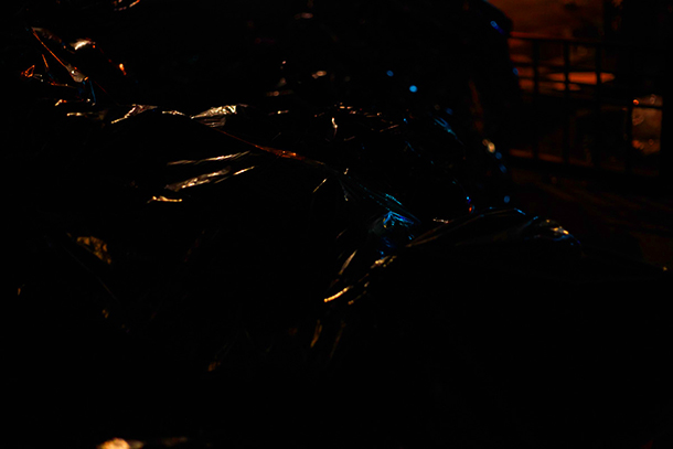
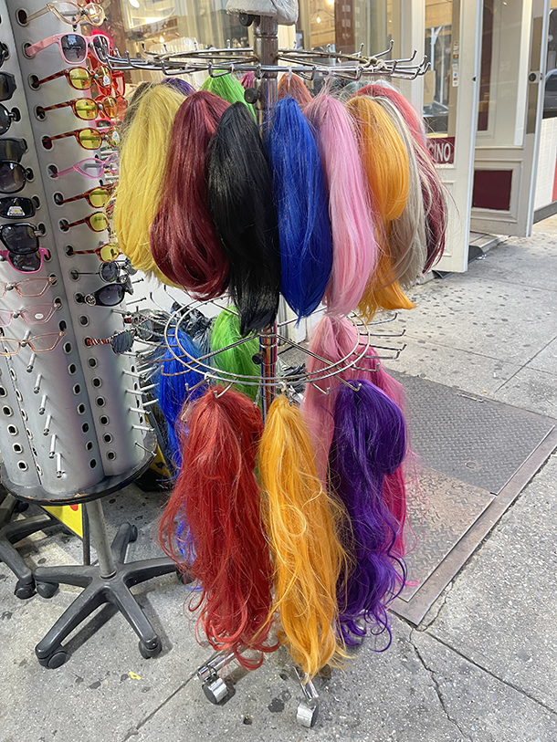
This month, we’re looking with interest at and generally indulging in a bit of a lovefest with color, glorious color. In a collection of wide-ranging photo essays, we let various colors, as they appear in photographs and artworks, display their charms and speak for themselves. As the month unfolds, we’ll be adding more images to each of the portfolios attached to each of the color swatches you see on this issue’s Home Page. Click on a color swatch to see a few or many examples of the colors under examination, which strut their stuff here in assorted hues and shades.
A reminder to students of color theory whose memories of long-ago art-school lectures have become foggy: A hue is the dominant color family or group to which a specific color belongs. White, black, and gray are not referred to as hues.
A shade is a pure hue or a mixture of pure colors to which a portion of black has been added, increasing darkness. A shade contains no white or gray. A tint is a mixture of a color with some amount of white, while a tone is made by mixing a color with gray or by both tinting and shading it.
Artists and designers also refer to tints and tones. We’ll save a discussion of those hair-splitting terms for sometime after we’ve finished sipping a glass of absinthe, which, by the way, is joyously green.
In a quote that appears on this month’s Big Page, the Post-Impressionist artist Paul Gauguin (1848-1903), who spent a decade toward the end of his life living and making art in French Polynesia, is remembered for his admonition that “[i]t is the eye of ignorance that assigns a fixed and unchangeable color to every object.”
Gauguin famously painted orange-brown bodies, blue-pink faces, and elements of nature to which he assigned vibrant colors he seemed to have extracted from deep within his subjects. In the early 20th century, such pioneering modernist painters as Vassily Kandinsky and Franz Marc, along with other Austrian and German Expressionists, offered acid-yellow cows, blue-purple horses, and other intensely colored images, while Robert Delaunay and Sonia Delaunay produced exuberant compositions animated by bold colors and geometric shapes.
Sprinkled throughout this month’s issue are comments about color from artists and other informed observers of one of the perceptible world’s most essential — and endlessly intriguing — phenomena.
We’re fond of the Minnesota-based artist Alma Realm’s pithy pronouncements about some of the colors that turn up routinely on her palette like familiar, endearing, very useful friends. “Blue is a small victory on a bad day,” Realm recently intoned.
In another recent e-mail message, she noted, “Red is as difficult to describe as it is to photograph. It nearly baffles the camera’s eye with its emitting power of life and well-cooked emotion. Red is a call to action.”

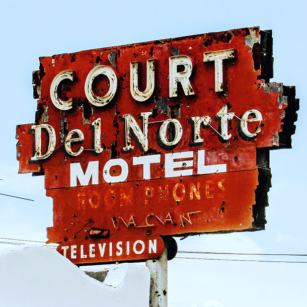
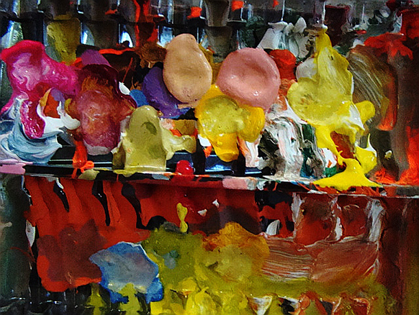
Realm is an artist who revels in bold color as much as she does in the malleability and luminosity of paint’s irresistible, viscous goo. With each brushstroke, she deploys her colors with gusto. It’s that same enthusiasm for different colors’ expressive power, light, and magic that draws us to them wherever or in whatever form they might appear, from plastic bottle caps to street signs, rubber gloves, ceramic tiles, moss-covered stones, illuminated glass, inflatable toys, and the bright-yellow petals of sunflowers in full bloom.
Color us seduced by color’s mysteries and charms. Aim your paint gun over here and blast away. Open your paint box and imagine the unimaginable.
Then make that first eager, impassioned, ambitious mark — and paint us a rainbow.